The Challenge: Managing Chaos at a Critical Moment
With the outbreak of the COVID-19 pandemic, the medical analysis firm Oncologica found itself on the front lines, transforming into a fundamental hub for rapid testing in the United Kingdom. To cope with the initial surge, a rudimentary digital platform had been hastily developed. However, this quick-fix solution, built under immense pressure without proper design or user research, quickly became the main bottleneck, creating more problems than it solved.
The challenge was immense. The existing platform was failing, threatening to compromise the efficiency and reliability of the service:
A Clunky Interface Leading to Errors: The initial platform was not intuitive. This led to significant manual data entry errors, sample mix-ups, and dangerous delays, as operators struggled to navigate a confusing system under pressure.
Lack of Traceability: It was nearly impossible to track a single test in real-time within the flawed system, causing inefficiency and frustration for both the staff and the patients waiting for results.
Inefficient Communication: The result notification process was unreliable and required constant manual intervention, creating an unsustainable workload for administrative staff and long wait times for patients.
The objective was clear: to conduct a complete redesign and rebuild of the platform, creating LAB360 based on deep user research to guarantee speed, accuracy, and scalability.
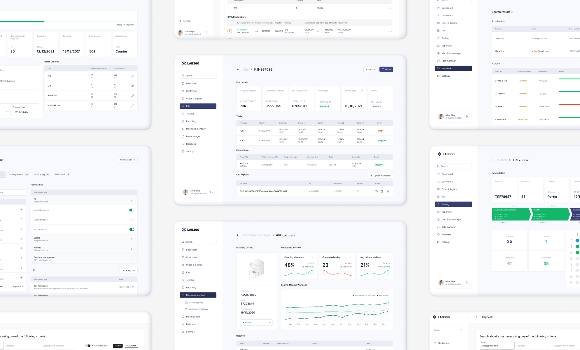
Machine Manager Screen
The Process: Human-Centered Redesign Under Pressure
As the Lead Product UX Designer for the design studio commissioned for the project, my role was to lead the redesign, diagnosing the failures of the initial version and creating a new solution that was not only technically functional but, above all, intuitive and error-proof for the operators.
Phase 1 - Field Research and Pain Point Mapping: Despite the urgency, we insisted on starting with research. I spent time with lab technicians, intake staff, and managers to map the entire existing process and, most importantly, to understand why the first version of the platform was failing its users. This led to the creation of key User Personas, such as "Marco, the Overwhelmed Lab Technician," whose frustrations became the foundation of our redesign.
Phase 2 - Architecture and Design System: With a clear understanding of the needs, I designed a completely new information architecture. Concurrently, I developed a comprehensive and modular Design System for LAB360. This was a strategic necessity: it allowed the development team (working with Vue.js) to rebuild the interface incredibly quickly and consistently, ensuring all components were uniform and reusable.
Phase 3 - Iterative Prototyping and Testing: I created a high-fidelity interactive prototype of the entire new application. This prototype became our "single source of truth." I used it to conduct usability testing sessions with Oncologica's actual operators. Watching them use the new prototype to perform tasks that were difficult on the old system allowed us to validate our design choices and resolve usability issues before a single line of new code was written.
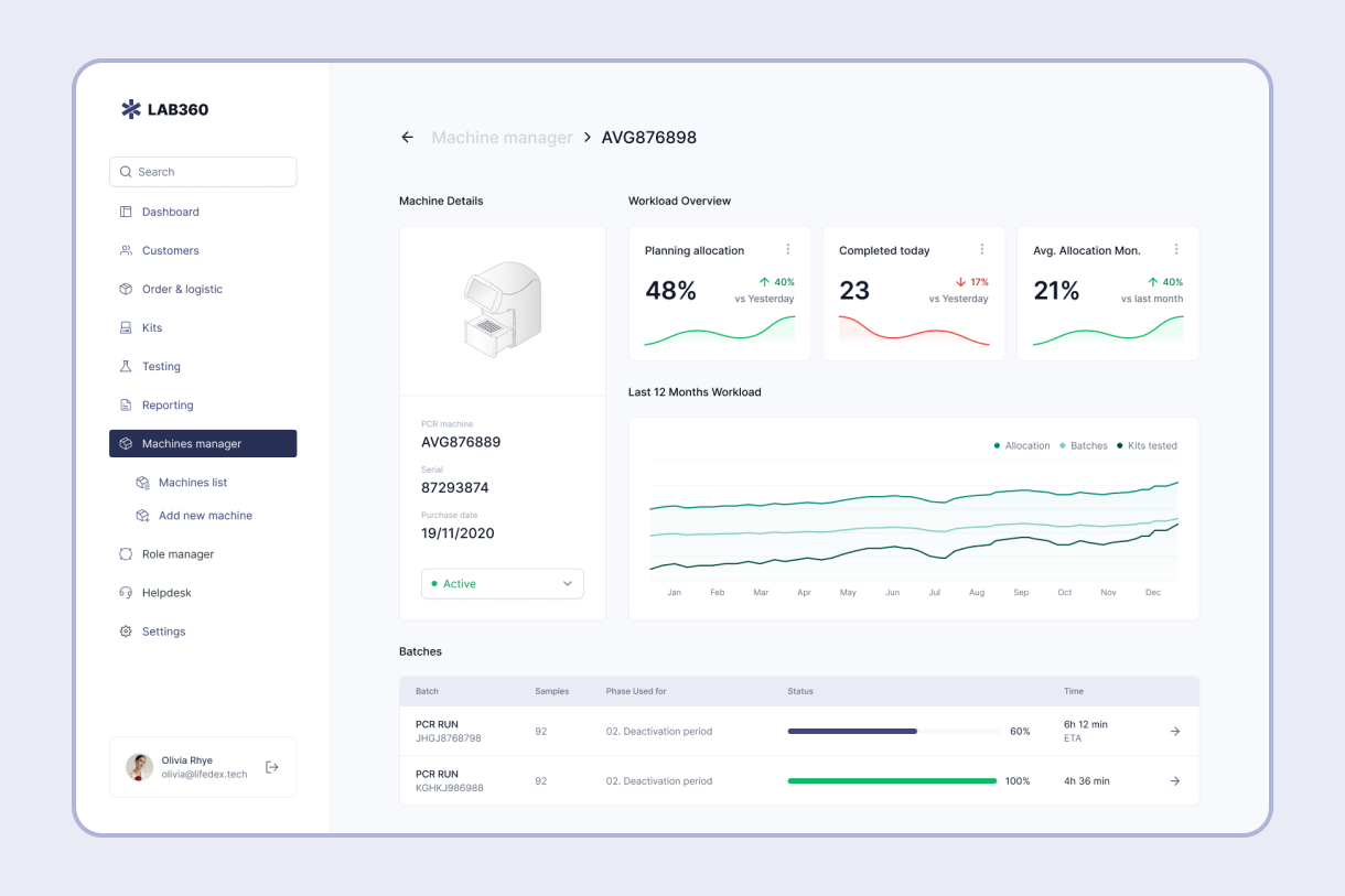
Order Management Screen
The Final Solution: LAB360, an Integrated Platform for Speed and Reliability
The result was LAB360, a robust and scalable web-based platform that completely replaced the old system, delivering immediate and measurable benefits.
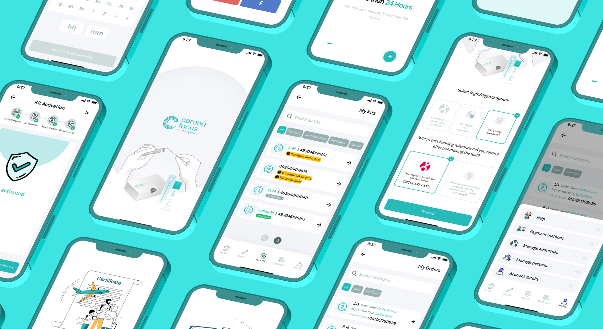
Optimized Workflow: The new solution introduced a guided, error-proof process, from scanning a patient's QR code at intake to entering the result with a simple click. The interface, redesigned based on UX research, was so intuitive that it required 50% less training time for the staff than initially estimated.
Increased Capacity and Error Reduction: The automation and redesigned flow led to a 95% reduction in transcription errors. This, combined with the new efficiency, allowed Oncologica to increase its test processing capacity by over 200% during peak times, without proportionally increasing administrative staff.
Instant Communication and Improved Patient Experience: We integrated a reliable, automated notification system via SMS and email. Patients received their results securely and instantly, eliminating the anxiety of waiting and freeing up the call center from thousands of calls per day.
This project solidified my conviction that a rigorous UX approach is not a cost, but the greatest value accelerator, especially in complex and mission-critical projects. It demonstrated how human-centered design can translate directly into operational efficiency, reliability, and, in this case, a better healthcare service in a time of crisis.
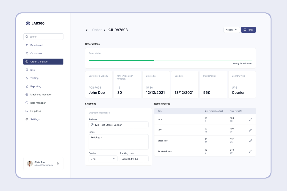
Helpdesk Screen
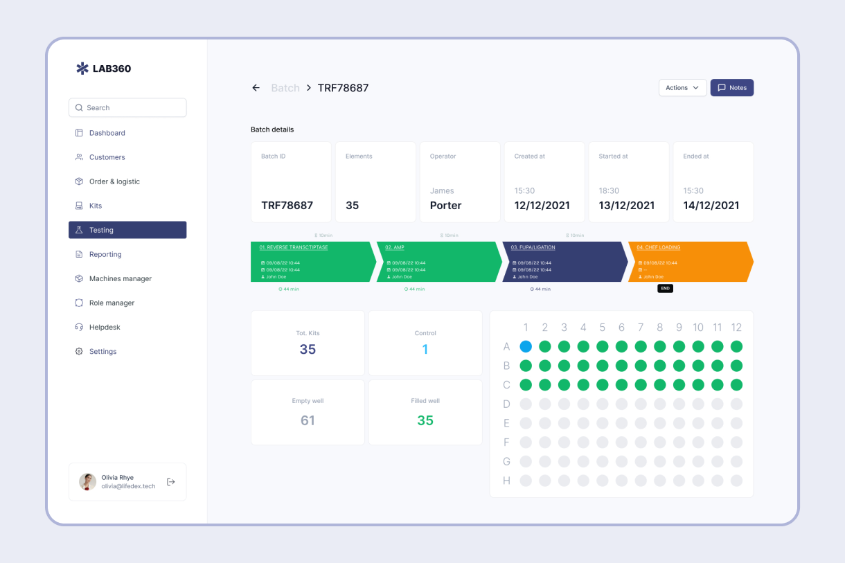
Test management screen
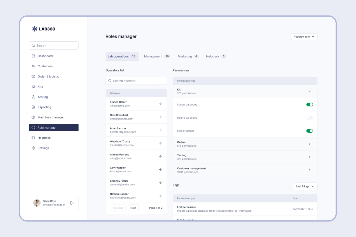
Roles Management screen
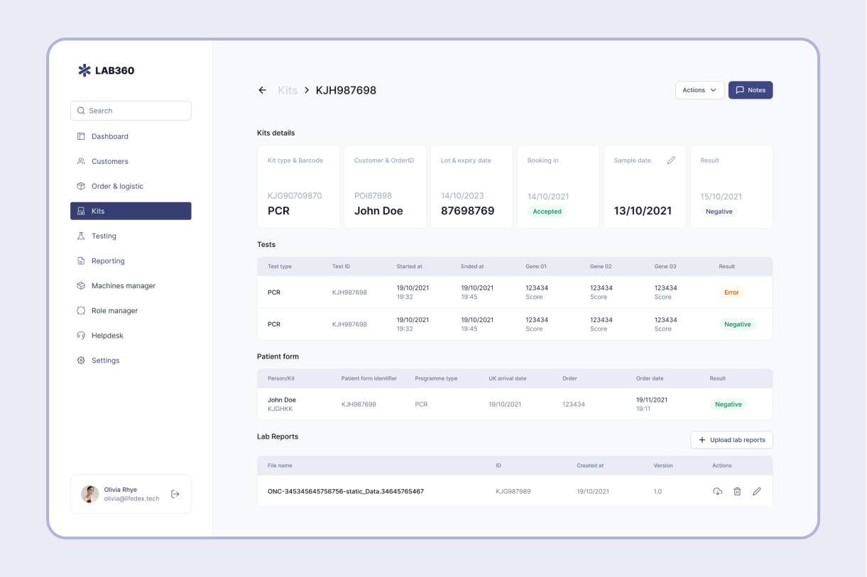
Kits management Screen
Let's talk about your project
Have an idea or a challenge to solve? Tell me about it, and I'll personally get back to you.